

Typography is a fundamental aspect of design that can significantly impact the effectiveness and appeal of a project. For designers, having access to a wide variety of fonts is essential. Fortunately, there is a wealth of free fonts available that can elevate your designs without breaking the bank. This article delves into the world of free fonts for designers and provides insights on how to choose and use them effectively.
The Role of Typography in Design
Typography goes beyond mere text; it is an art form that communicates mood, tone, and personality. The right font choice can enhance readability, establish a visual hierarchy, and evoke emotions. Designers must consider factors such as legibility, aesthetics, and context when selecting fonts for their projects.
Popular Free Font Categories
Free fonts come in various styles, each suited to different design needs. Here are some popular categories:
- Serif FontsSerif fonts are characterized by small lines or strokes at the ends of letters. They are often associated with tradition and reliability, making them suitable for formal documents and print media. Examples include:
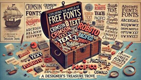
- Crimson Text: Ideal for long-form text in books and articles.
- Merriweather: A versatile serif font that works well on screens.
- Sans-Serif FontsSans-serif fonts lack the small lines at the ends of letters, giving them a clean and modern look. They are commonly used in digital media and branding. Examples include:
- Roboto: Widely used in web design for its readability and versatility.
- Open Sans: A neutral and friendly font suitable for various purposes.
- Script FontsScript fonts mimic cursive handwriting and are often used for decorative purposes. They can add a touch of elegance and personality to a design. Examples include:
- Pacifico: A playful script font perfect for creative projects.
- Dancing Script: Suitable for informal and artistic designs.
- Display FontsDisplay fonts are designed to be attention-grabbing and are used for headlines, posters, and logos. Examples include:
- Oswald: Bold and impactful, great for headlines.
- Lobster: A stylish and unique font for standout text.
Top Resources for Free Fonts
Finding high-quality free fonts is easier with the right resources. Here are some top platforms where designers can access free fonts:
- Google FontsGoogle Fonts is a comprehensive resource with a vast collection of free fonts. The platform allows users to preview and compare fonts, making it easier to find the perfect match.
- Font SquirrelFont Squirrel offers a curated selection of high-quality free fonts. The site also provides tools for testing fonts and generating web font kits.
- DaFontDaFont is a popular platform with an extensive library of fonts. Fonts are categorized by style, making it easy to find what you need.
- BehanceBehance is a platform for creative professionals to showcase their work. Many designers share free fonts as part of their portfolios, providing unique and innovative options.
Tips for Selecting the Right Font
Choosing the right font involves more than just aesthetics. Here are some tips to help you make the best choice:
- Prioritize ReadabilityEnsure the font is easy to read, especially for body text. Avoid overly decorative fonts for large blocks of text.
- Consider the Project ContextSelect a font that aligns with the project’s purpose and audience. For example, a serif font may be suitable for a formal document, while a sans-serif font may be better for a modern website.
- Test the Font in Your DesignBefore finalizing your choice, test the font in the actual design to see how it looks in context. This can help you avoid any issues with readability or style.
- Check Licensing TermsEven though the fonts are free, it’s important to check the licensing terms. Some fonts may have restrictions on commercial use.
Best Practices for Using Free Fonts
Effective use of free fonts can enhance your design and ensure a professional look. Here are some best practices:
- Pair Fonts ThoughtfullyFont pairing involves combining two or more fonts that complement each other. This can create contrast and visual interest. For example, pairing a serif font with a sans-serif font can balance readability and style.
- Maintain ConsistencyConsistency in font usage helps create a cohesive design. Use the same font for headings and another for body text to establish a clear visual hierarchy.
- Adjust SpacingPay attention to letter-spacing (tracking) and line-spacing (leading). Proper spacing improves readability and prevents the design from looking cluttered.
- Use Fonts ResponsivelyEnsure that fonts are responsive and look good on different screen sizes and resolutions. Test your design on various devices to confirm this.
Conclusion
Free fonts are a valuable resource for designers, offering a wide range of styles and functionalities without the cost. By understanding the different categories of fonts and knowing where to find high-quality options, designers can enhance their projects with beautiful and functional typography. Remember to prioritize readability, consider the project context, and follow best practices for font usage. With the right fonts, you can create visually appealing and effective designs that communicate your message clearly and leave a lasting impression.
This post was created with our nice and easy submission form. Create your post!


Comments
0 comments